Variant Selector
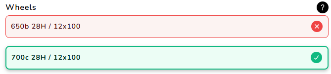
Shows compatibility for variants of single product, allowing for selection of a specific variant.
This is designed to be used on a product page.
Component Details
<bikematrix-variantselector
  data-variants="sku1|title1|id1|1~sku2|title2|id2|2"
  data-delimiter="|"
  data-clickable="true"
  data-full-width="true"
  data-title="Title Text"
  data-route-variant="true"
  data-padding-top="5"
  data-padding-bottom="5"
  data-showall="true"
  data-override="true"
>
</bikematrix-variantselector>
Attributes
| Attribute | Default | Required | Description | Example |
|---|---|---|---|---|
data-variants | "" | Yes | A list of data for each product variant to check / display. Detailed further at data-variants explained | "-|Sku Name|45546911891733|1" |
data-delimiter | "|" | No | The delimiter to use in data-variants to separate the different data for each product variant. | "|" |
data-clickable | "false" | No | Makes the variant clickable, allowing users to use this to select a variant. This works through adding a query parameter to the URL ?variant={VARIANT_ID}. Where VARIANT_ID is the variant Id set in data-variants. | "true" |
data-full-width | "false" | No | Whether to make the component take up the full width. Setting data-override will also do this. | "true" |
data-title | "Compatible Variants" (Translated) | No | Title used at the top of the component. | "Brake Pads" |
data-route-variant | "false" | No | Whether to automatically select the first compatible variant for the product. Similar to data-clickable, this uses the ?variant={VARIANT_ID} URL query parameter to select a variant. | "true" |
data-padding-top | "0" | No | The number of pixels to add as padding above the component. | "10" |
data-padding-bottom | "0" | No | The number of pixels to add as padding below the component. | "10" |
data-showall | "false" | No | Shows all variants regardless of compatibility status of the variant. This has lots of overlap with data-override and should be set in to the same value as that attribute. | "true" |
data-override | "false" | No | Shows all variants regardless of compatibility status of the variant, this also sets the component to full width. This has lots of overlap with data-showall and should be set in to the same value as that attribute. | "true" |
data-variants explained
The data-variants sets all the variants data to be used by the component.
"sku1|title1|variant-id1|index1~sku2|title2|variant-id2|index2~sku3|title3|variant-id3|index3";
- Each variant is delimited by
~, this cant be changed. - Each piece of data for a variant is delimited by
|, this can be changed by thedata-delimiterattribute.
Now for each variant there are 4 bits of data to provide in the following order:
- SKU: This is the SKU of the variant. If this matches the variant ID, this can be set to
-and the variant ID will be used as the SKU. A '*' can be passed in to indicate a 'Blacklisted' product, where no compatibility status will be shown. - Title: This is the display name for the variant.
- Variant ID: This is the identifier for the variant of the product. This may be the same as the SKU.
- Index: This is just a simple numbering system for ordering the variants. The values should be
1,2,3etc.
Example
<bikematrix-variantselector
  data-title="Compatible Variants"
  data-override="true"
  data-showall="true"
  data-variants="-|SRAM Bottom Bracket GXP Team Cups English MTB & Road 73 / 68|45546911891733|1~-|SRAM Bottom Bracket GXP Team Cups English 83|45546911990037|2~-|SRAM Bottom Bracket GXP Team Cups English 100 for GXP Fat Bike Crank|48195360456981|3"
  data-clickable="true"
></bikematrix-variantselector>
Configuration
A more detailed overview of configuration can be found in the Configuration section.
These options are to be set on a per web page basis:
| Option | Type | Required | Description | Example |
|---|---|---|---|---|
productCollections | string[] | Yes | List of collections the product belongs to. Each value of the list should match a handle in the collections. | ["brake-pads","brake-rotors"] |