Compatible List
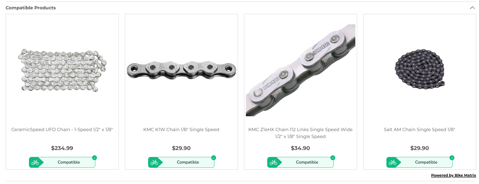
Displays a list of all products which are compatible.
This is designed to be used at the top of a page of a collection.
Component Details
The web component takes a child template element for use when displaying product cards. This allows you to customise the design of your product cards displayed inside of the Compatible List component.
<bikematrix-compatiblelist data-title="Compatible List">
  <!-- Product Card Template (optional) -->
  <template slot="product-card">
    <!-- Product Card HTML -->
  </template>
  <!-- End of Product Card Template -->
</bikematrix-compatiblelist>
Product Card Template
To customise your product card, you can provide html inside the <template slot="product-card"> element.
You can use product data inside this template as you can see in the example.
This product data is set in products variable in the configuration.
Attributes
| Attribute | Default | Required | Description | Example |
|---|---|---|---|---|
data-title | "Compatible Products" (Translated) | No | Text at the top of the component. | "Compatible Products" |
Example
<bikematrix-compatiblelist data-title="Compatible Products">
  <!-- Product Card Template (optional) -->
  <template slot="product-card">
    <div class="bm-compatible-product-wrapper">
      <div class="bm-compatible-product-image">
        <a href="{{productUrl}}">
          <img src="{{featuredImage}}" width="80px" alt="" loading="lazy" />
        </a>
      </div>
      <div class="bm-compatible-product-title">
        <a href="{{productUrl}}">{{ productTitle }}</a>
      </div>
      <div class="bm-compatible-product-price">
        <a href="{{productUrl}}">
          <p><strong>{{ price }}</strong></p>
        </a>
      </div>
      {{ compatibility }}
    </div>
  </template>
  <!-- End of Product Card Template -->
</bikematrix-compatiblelist>
Configuration
A more detailed overview of configuration can be found in the Configuration section.
These options are to be set on a per web page basis:
| Option | Type | Required | Description | Example |
|---|---|---|---|---|
currentCollectionHandle | string | Yes | The collection handle of the current page. This must match a handle defined under collections. | "brake-pads" |
products | {[key: string]: ProductInfo} | Yes | Information for all products to check compatibility on. Find more information in the 'products' explained section. | See 'products' explained section. |
collectionUrl | string | No | URL for the current collection, used to link back to the first page of the collection. Default is empty. | "/collections/brake-pads" |
compatiblityListCurrentPage | number | No | Current page number of the collection. After 1st page we link back to the first page for the compatible results. Default is 0. | 1 |
showCompatibleList | boolean | No | Whether to show compatible list component. Default is true. | true |
'products' explained
products is defined as:
{
  [key: string]: {
    "skus": string[],
    "productUrl": string,
    "productTitle": string,
    "featuredImage": string,
    "price": string,
    "priceFrom": string,
    [key: string]: any
  }
}
Therefore this is a keyed list of all the products to include as part of the compatible list check.
- The first
keyvalue should be your product ID. - The
skusvalue should be a list of all the SKUs for the product. (As the product may have multiple variants)
All other variables for the product are there to be used as part of the injected HTML into the web component. This HTML is for displaying the product card therefore will need to use some of this information, but usage will vary on your product card.
An example of the products configuration option is:
{
  "123": {
    "productUrl": "/product",
    "productTitle": "SRAM Large Disc Brake Pads",
    "featuredImage":
      "https://www.biketart.com/cdn/shop/files/HeavyDuteSintered.jpg?v=1714977245&width=1950",
    "price": "$40.00",
    "skus": ["710845642012"]
  },
  "124": {
    "productUrl": "/product",
    "productTitle": "Jagwire Pro E-Bike Disc Pad - SRAM Code",
    "featuredImage":
      "https://www.biketart.com/cdn/shop/files/39869-pm.jpg?v=1692603872&width=750",
    "price": "$34.00",
    "skus": ["4715910041895"]
  }
}